

We’re excited to announce the launch of our three new custom Adalo components! These components will enhance your app’s user interface and user experience. With these new additions, you’ll be able to create a more seamless and intuitive app for your users.
So what are these new components?
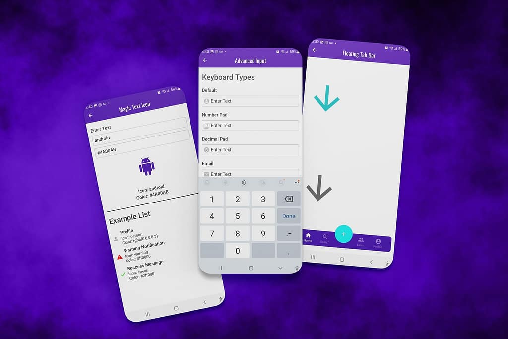
We’ve created the “Advanced Input Component”, “Floating Tab Bar” component, and a “Magic Text Icon” component. These components will help you create a more professional, modern look for your app.
The Advanced Input Component offers users a visually appealing and easy-to-use input field. This component is perfect for when you need to capture information from your users quickly and accurately.
The Floating Tab Bar component allows you to add a tab bar at the bottom of each screen that can be used as navigation with a floating call-to-action button. This component will help keep your app organized while making it easier for users to get where they need to go.
Lastly, the Magic Text Icon component lets you add dynamic icons to your app. These icons can be used as visual indicators that help guide your users through the app’s journey, display statuses, or show context.
You can purchase these custom Adalo components on our Templar Design Marketplace web app (which was made on, you guessed it, Adalo!)!
If you’ve read my article about the Roadmap To A Great App, you’ll know that you need to choose your tools carefully. These components will help you enhance the overall UI/UX for your app users, which makes your apps smooth and as seamless as possible.
 The Advanced Input Component
We’ve identified a problem with Adalo’s Input component. When you set Adalo’s input to a number input, the keyboard stays as the default qwerty keyboard on native devices. We’ve solved this problem with our new Advanced Input custom Adalo component!
The Advanced Input Component is the first of our custom Adalo components and it makes it easy to set the keyboard type to be used on native devices, default value, placeholder text, max characters, and even a submit action when users press “Enter” on their keyboard (for desktop web apps). This way you can ensure that your form is as user-friendly as possible.
The Advanced Input Component also comes equipped with a left icon that you can enable or disable, as well as the ability to set the input as a password input. We have made sure that all of these settings are fully customizable, with just a few clicks.
Finally, we’ve included various styling options that allow you to customize the look and feel of your input fields. This way, you can make sure that it fits seamlessly into your existing Adalo application and keep your users engaged.
With the Advanced Input Component in Adalo, you can finally achieve the perfect input form with minimal effort and time. Now your users can submit their data quickly and easily! So why settle for anything less? Get the Advanced Input Component today, and make your forms complete.
What makes the Advanced Input Component different than Adalo’s default input component?
– Set Keyboard Type
The Set Keyboard Type setting allows you to select the keyboard type that will be used when the input component is active. The options are Default Input, Number Pad Input, Email Input, and Phone Pad Input.
– Password Field
The password field toggle enables the input component to be used as a password field. When this toggle is turned on, the characters typed by the user will be hidden and a visibility icon will be displayed. Tapping the visibility icon will reveal the password.
– Left Icon
You can enable or disable the display of a left icon with the “Display Icon” toggle. You can also set the color and size of the icon. Then, you can set the enabled/disabled password icons and the colors.
– Submit Action (for web apps)
The Submit Action setting allows you to set an action that will be triggered when the user presses the enter key on the keyboard. This setting is helpful for ensuring that your users can submit their information without having to click a submit button. This setting does not work when “Allow Multiple Lines” is enabled.

 The Floating Tab Bar Component
Looking for a tab bar navigation component with a floating action button?
Look no further, because the Floating Tab Bar Component for Adalo has everything you need. It’s easy to customize the action button, tab bar background color, and tab bar text color to match your app’s design. Plus, it includes an extra large floating action button that’s perfect for primary actions.
Give your users an intuitive and efficient way to navigate through your app with the Floating Tab Bar Component for Adalo. It’s simple to use and customizable so you can create the perfect user experience for your app.
Download the Floating Tab Bar Component for Adalo today!
Features:
– Customizable action button
– Easy to customize tab bar background color and border-radius
– Extra large floating action button for primary actions
– Intuitive navigation for users
– Simple to use and customize
– Perfect user experience for your app.

 The Magic Text Icon Component
A cool new way to change your icons!
The Magic Text Icon is the 3rd of our new custom Adalo components and it is a great way to spice up your app with minimal effort. With this component, you can change the icon and the color of the icons by setting them via magic text. This makes it super easy to use and gives you more control over how your app looks.
With this component, you can quickly and easily change the look of your app without having to go through a lot of hassle. You can also choose from a variety of colors so that you can find the perfect icon for your needs. Plus, using magic text makes it super simple to set up and get started right away.
Features:
– Quick and easy to set up with magic text
– Change the icon and color of your icons via magic text
– Perfect for setting icons in custom lists
– Simple to use and get started right away!

3 NEW Custom Adalo Components To Enhance Your App UI/UX Summary
We’re excited to see what you create with our new custom Adalo components! Sign up for Adalo today and start using the Advanced Input Component, Floating Tab Bar, and Magic Text Icon custom Adalo components in your app. These 3 custom Adalo components are the perfect way to make your app look professional and modern.3
You can purchase any (or all) of these custom Adalo components directly from our Templar Design Marketplace.
If you experience any difficulties or have any questions, please don’t hesitate to reach out. We’re always here to help!

0 Comments